
Digital publication design stands at the intersection of creativity and technology, transforming traditional print media into dynamic digital experiences. In today’s fast-paced digital world, it’s not just about making content look pretty – it’s about crafting immersive experiences that captivate readers across multiple devices and platforms.
From sleek e-magazines to interactive annual reports, digital publication design has revolutionized how we consume and interact with content. Whether it’s a simple PDF conversion or a fully interactive digital magazine with embedded videos and animations, designers now wield powerful tools to create engaging publications that were impossible just a few years ago. The possibilities are endless, and the future of digital publishing continues to evolve at lightning speed.
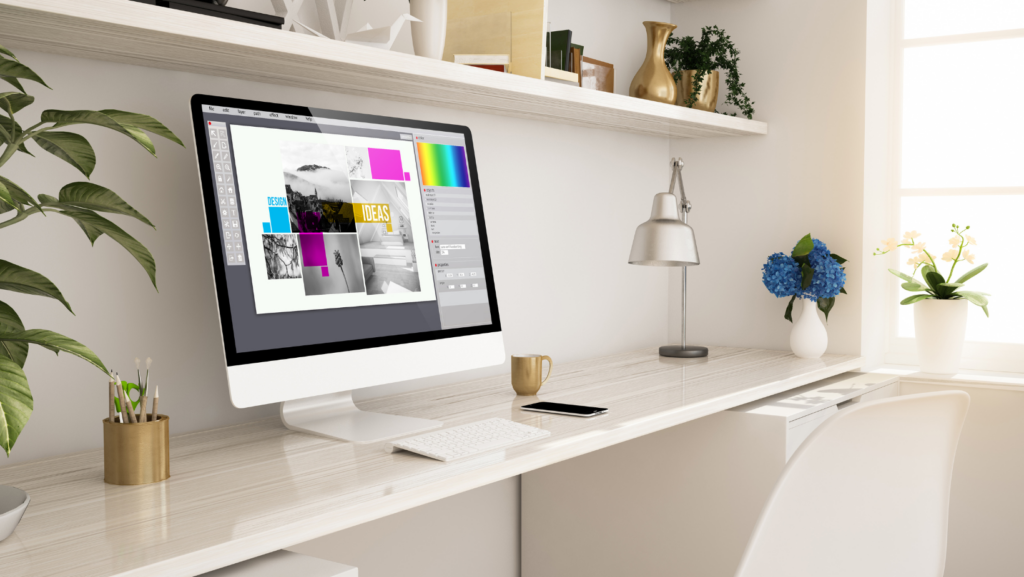
Digital Publication Design
 Digital publication design transforms static content into dynamic reading experiences through strategic layout decisions multimedia integration. The following elements create effective digital publications that engage modern readers across multiple devices.
Interactive elements enhance digital publications through clickable navigation menus video embeds social media integration. Responsive layouts automatically adjust content display across smartphones tablets desktop screens. Typography choices include web-safe fonts variable sizing dynamic spacing for optimal readability. Multimedia components encompass:
- Image galleries with zoom capabilities high-resolution photos
- Audio players for podcasts background music narration
- Video content embedded seamlessly within articles
- Interactive infographics data visualizations charts
- Hyperlinked cross-references related content suggestions
- Font sizes starting at 16 pixels for body text
- Color contrast ratios meeting WCAG 2.1 accessibility standards
- Touch targets measuring 44×44 pixels minimum
- Loading speeds under 3 seconds per page
- Scrolling navigation with clear visual feedback
- Header footer elements remaining consistent throughout
Responsive Design for Multiple Devices
Digital publication designs adapt seamlessly across various devices through responsive frameworks ensuring optimal viewing experiences. These designs automatically adjust content layout based on screen dimensions enhancing readability across smartphones tablets laptops.
Mobile-First Approach
Mobile-first design prioritizes smartphone interfaces as the primary development focus. Content elements stack vertically on mobile screens with simplified navigation menus text size adjustments touch-friendly buttons. This approach incorporates essential content first dropping non-critical elements for smaller displays while progressively enhancing features for larger screens. Critical design elements include:
- Touch targets measuring 44×44 pixels minimum
- Single-column layouts with 16px font sizes
- Compressed images optimized for mobile bandwidth
- Streamlined navigation with hamburger menus
- Performance optimization targeting 3-second load times
Adaptive Layouts
Adaptive layouts utilize distinct breakpoints to create customized experiences for specific device categories. These designs detect screen sizes platform types then load pre-configured layouts optimized for each scenario. Key adaptive features include:
- Fluid grids that reorganize content blocks automatically
- Flexible images scaling proportionally within containers
- CSS media queries targeting common device dimensions
- Content prioritization based on viewport size
- Dynamic typography scaling with relative units
| Device Category | Typical Breakpoint | Layout Focus |
|---|---|---|
| Smartphones | 320-480px | Single column |
| Tablets | 768-1024px | Two columns |
| Desktop | 1024px+ | Multi-column |
Typography in Digital Publications
 Typography serves as the foundation of digital publication design, combining font selection, spacing, and hierarchy to enhance readability across digital platforms. The strategic implementation of typographic elements creates visual appeal while maintaining content accessibility.
Digital publications leverage web-safe fonts and custom typefaces through services like Google Fonts or Adobe Fonts to maintain consistent branding. Sans-serif fonts such as Open Sans, Roboto or Inter excel in digital environments due to their clean lines and optimal screen rendering. Font sizes range from 16-18px for body text on desktop devices to 14-16px on mobile screens. Line heights of 1.5 to 1.8 times the font size create comfortable reading spaces. Progressive loading techniques enable custom fonts to display quickly while maintaining system font fallbacks for faster initial page renders.
Hierarchy and White Space
Typographic hierarchy guides readers through content using distinct size variations between headings, subheadings, and body text. Primary headings typically measure 200-300% larger than body text, while secondary headings range from 150-200% larger. Generous white space margins of 24-32px separate content sections to reduce visual fatigue. Leading elements maintain 16px minimum spacing from surrounding content. Strategic padding around text blocks creates breathing room that improves content scanning. Consistent spacing patterns between related elements establish rhythm throughout the publication layout.
Interactive Design Elements
Interactive design elements transform static digital publications into dynamic reading experiences by engaging users through clickable components multimedia features. These elements create an immersive environment that enhances reader engagement while maintaining intuitive functionality.
Navigation Systems
Digital publications incorporate sophisticated navigation systems that enable seamless content discovery. Interactive tables of contents feature jump links to specific sections articles chapters. Touch-enabled gestures support natural page flipping swiping interactions on mobile devices. Navigation bars remain fixed at strategic positions offering quick access to essential functions like search bookmarking sharing. Progress indicators show readers their location within the publication while breadcrumb trails facilitate easy backtracking. Smart navigation menus collapse expand based on screen size preserving valuable display space on smaller devices.
Rich Media Integration
Digital publications leverage diverse media types to create compelling content experiences. Interactive infographics respond to user input displaying detailed data visualizations. Embedded video players integrate seamlessly with text content offering contextual visual information. Audio elements include podcast snippets background music narration options. Image galleries feature high-resolution photos with zoom capabilities touch-friendly controls. Social media widgets enable real-time content sharing reader discussions. Interactive quizzes polls engage readers through participatory elements encouraging active involvement with the content. Each media element loads progressively optimizing performance across different network conditions.
Optimization for Digital Platforms
Digital platforms demand specific optimization strategies to deliver content effectively across various devices and network conditions. The focus remains on creating seamless experiences while maintaining performance standards.
Performance Considerations
Digital publication optimization starts with compressed image formats like WebP AVIF that reduce file sizes by 30% compared to traditional formats. Implementation of lazy loading defers non-critical resources loading graphics video elements when users scroll to them. Progressive loading techniques display text content first followed by media elements enabling readers to start consuming content immediately. Content delivery networks (CDNs) distribute assets across global servers reducing load times by 50-70% for international audiences. Resource caching stores frequently accessed elements locally cutting subsequent page load times to under 2 seconds.
Cross-Platform Compatibility
Digital publications utilize responsive frameworks that adapt content presentation across desktop mobile tablet devices. CSS Grid Flexbox layouts create fluid designs that automatically adjust to different screen dimensions. Browser feature detection enables progressive enhancement serving optimal experiences based on device capabilities. SVG graphics maintain clarity across display resolutions eliminating the need for multiple image versions. Touch-friendly interfaces incorporate gesture controls swipe navigation tap targets sized at 44×44 pixels minimum. Media queries trigger specific styling rules at defined breakpoints optimizing layouts for portrait landscape orientations.
Best Practices for Digital Publication Design
Digital publication design integrates aesthetics with functionality to create engaging reading experiences. These practices prioritize user engagement while maintaining technical excellence across platforms.
User Experience Guidelines
Effective digital publications incorporate intuitive navigation systems with clear visual hierarchies. The interface features prominent calls-to-action placed in predictable locations across pages. Touch targets measure 44×44 pixels minimum for optimal interaction on mobile devices. Interactive elements display hover states on desktop devices while providing clear feedback on mobile taps. Content layouts maintain consistent spacing with 16-24 pixel margins between elements. Navigation menus remain fixed at predictable screen locations enabling quick access to core functions. Load times stay under 3 seconds through optimized assets progressive loading techniques. Information architecture follows F-pattern scanning behavior with key content positioned along natural eye movement paths.
Accessibility Standards
Digital publications incorporate WCAG 2.1 Level AA compliance standards throughout their design. Text maintains a minimum contrast ratio of 4.5:1 against background colors. All interactive elements include ARIA labels describing their function to screen readers. Image elements contain descriptive alt text conveying their meaning context. Navigation structures support keyboard controls with visible focus indicators. Typography scales from a 16-pixel base size maintaining legibility across devices. Color combinations avoid problematic combinations for colorblind users. Audio video content includes synchronized captions transcripts. Form elements feature visible labels clear error messaging input validation. The content structure uses semantic HTML elements establishing a logical reading order.
Digital publication design has revolutionized how readers interact with content across devices and platforms. The fusion of responsive layouts interactive elements and thoughtful typography creates immersive experiences that engage modern audiences effectively.
Success in digital publication design relies on balancing aesthetics with functionality while maintaining accessibility standards. By embracing these design principles publishers can create dynamic digital experiences that resonate with readers and stand the test of time.
The future of digital publications will continue to evolve as new technologies emerge offering even more opportunities for innovative design solutions that enhance user engagement and content delivery.